UI design, content refresh, and visual
revitalization of product landing pages
Client
Motivation Direct
Year
2024
Services
Branding
Visual Design
UI Design
Hero
Landing Page Headers
When form starts to dominate content
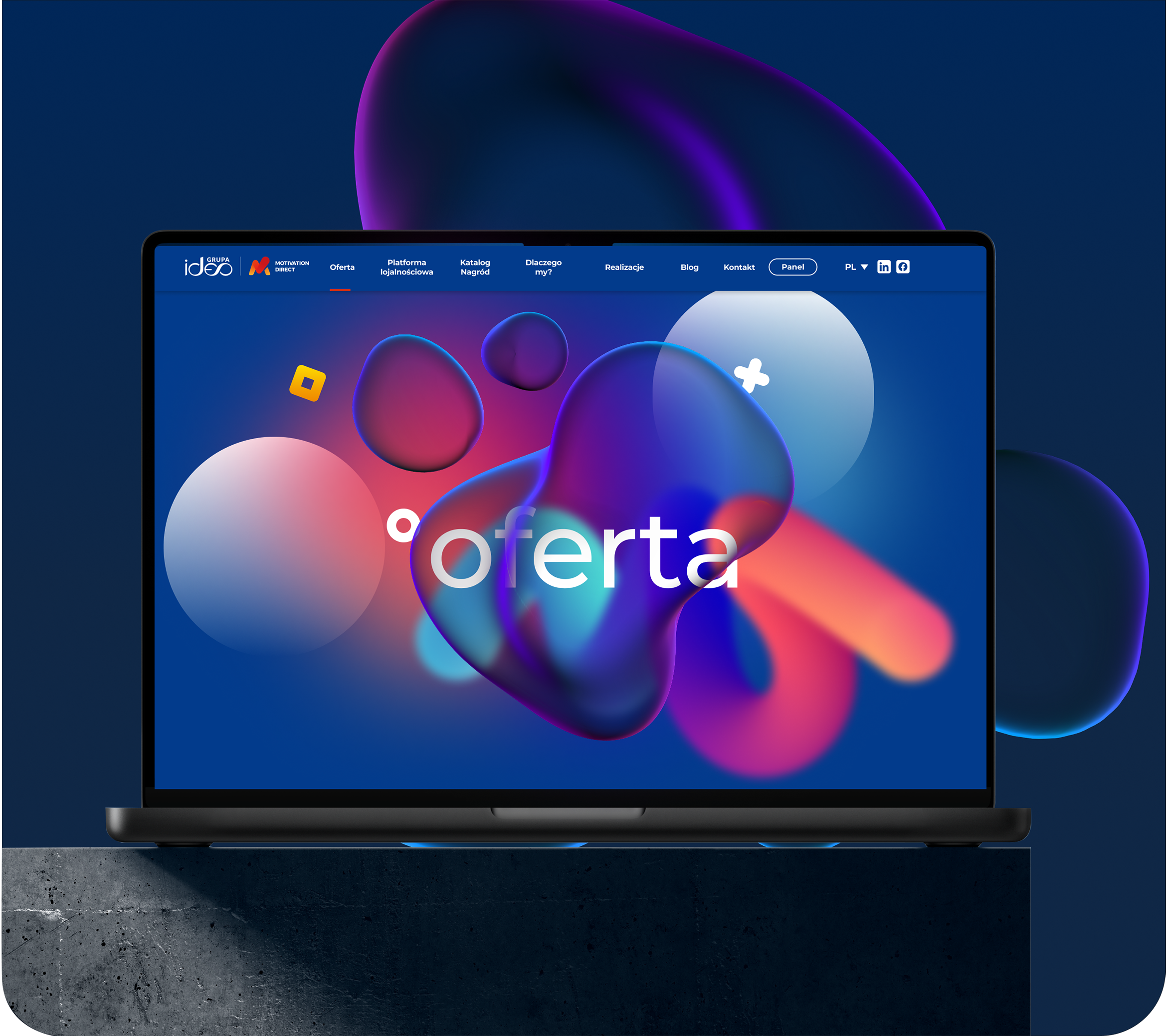
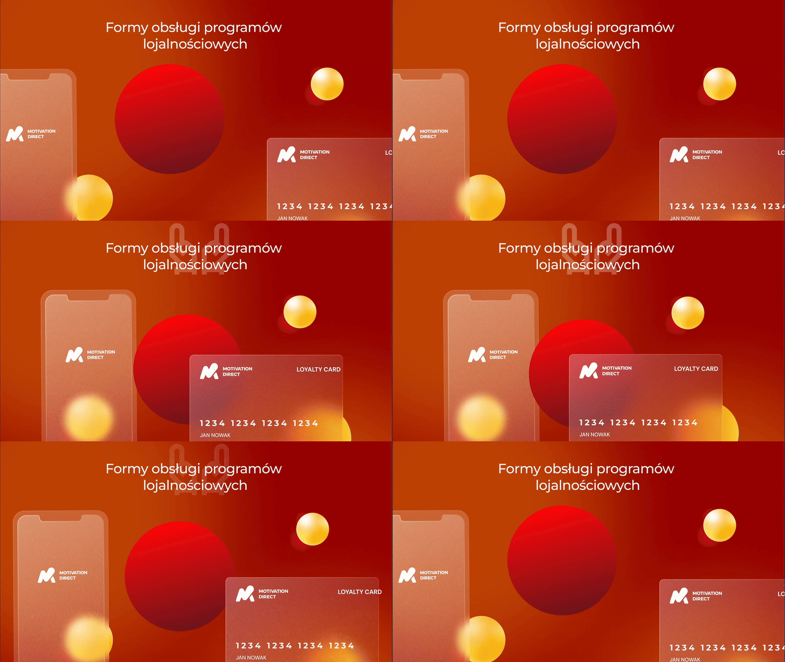
Motivation Direct is a strong brand with a well-recognized identity. While designing their product landing pages, the main challenge was the brand’s intense color palette — striking in print, but overwhelming in digital form. The project focused on softening the perception, introducing clarity, and achieving visual balance. My goal was to organize both content and visuals so that users could easily understand the offer — without clutter, confusion, or visual fatigue.
My Actions
Content & UX Analysis
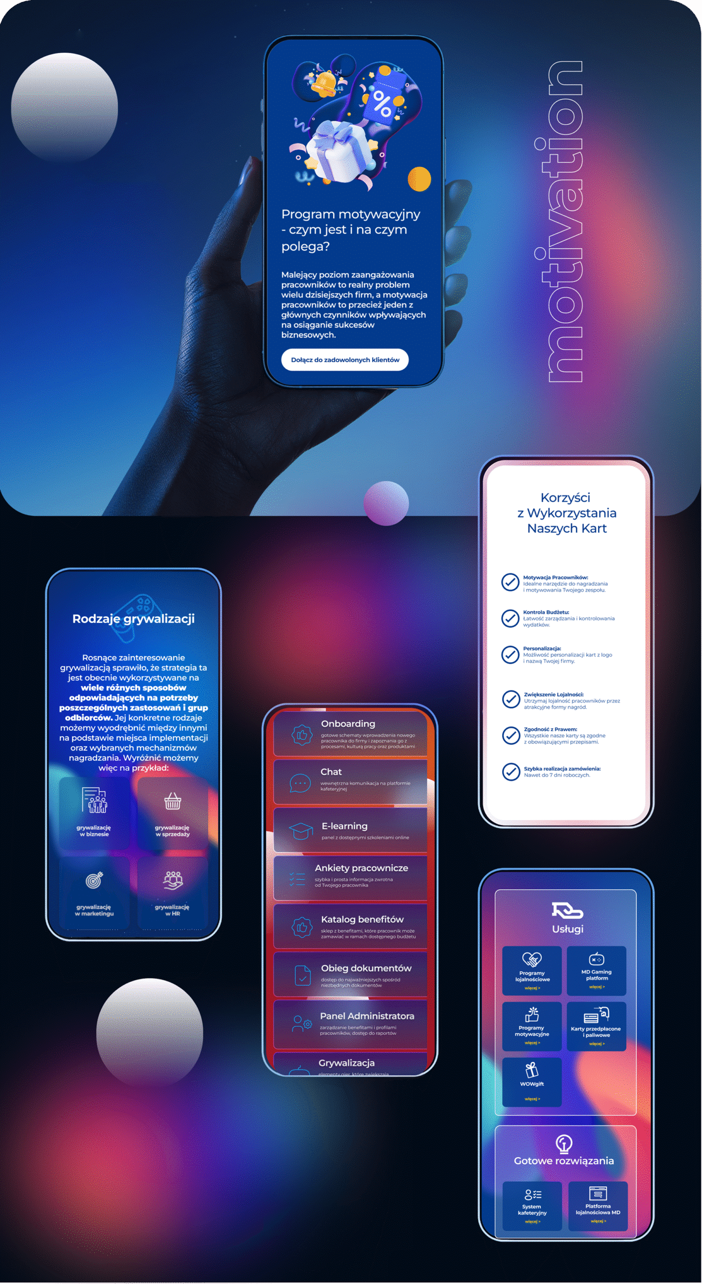
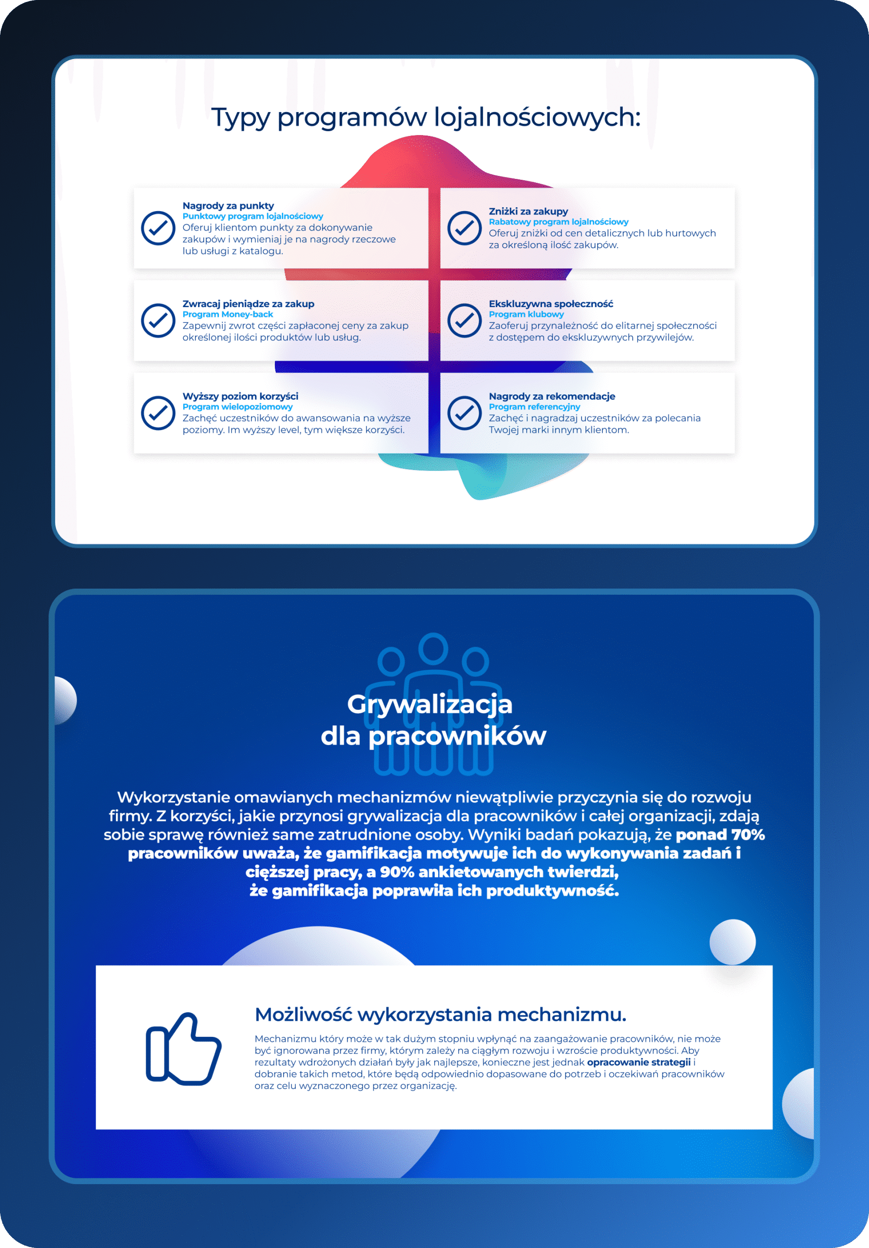
The project began with a detailed analysis of the content structure. I identified areas requiring simplification, reorganization, or division into thematic sections. I proposed layout adjustments that improved content scannability and focused users’ attention on the key benefits. Special emphasis was placed on optimizing the user experience for the B2B audience.
Interface Design
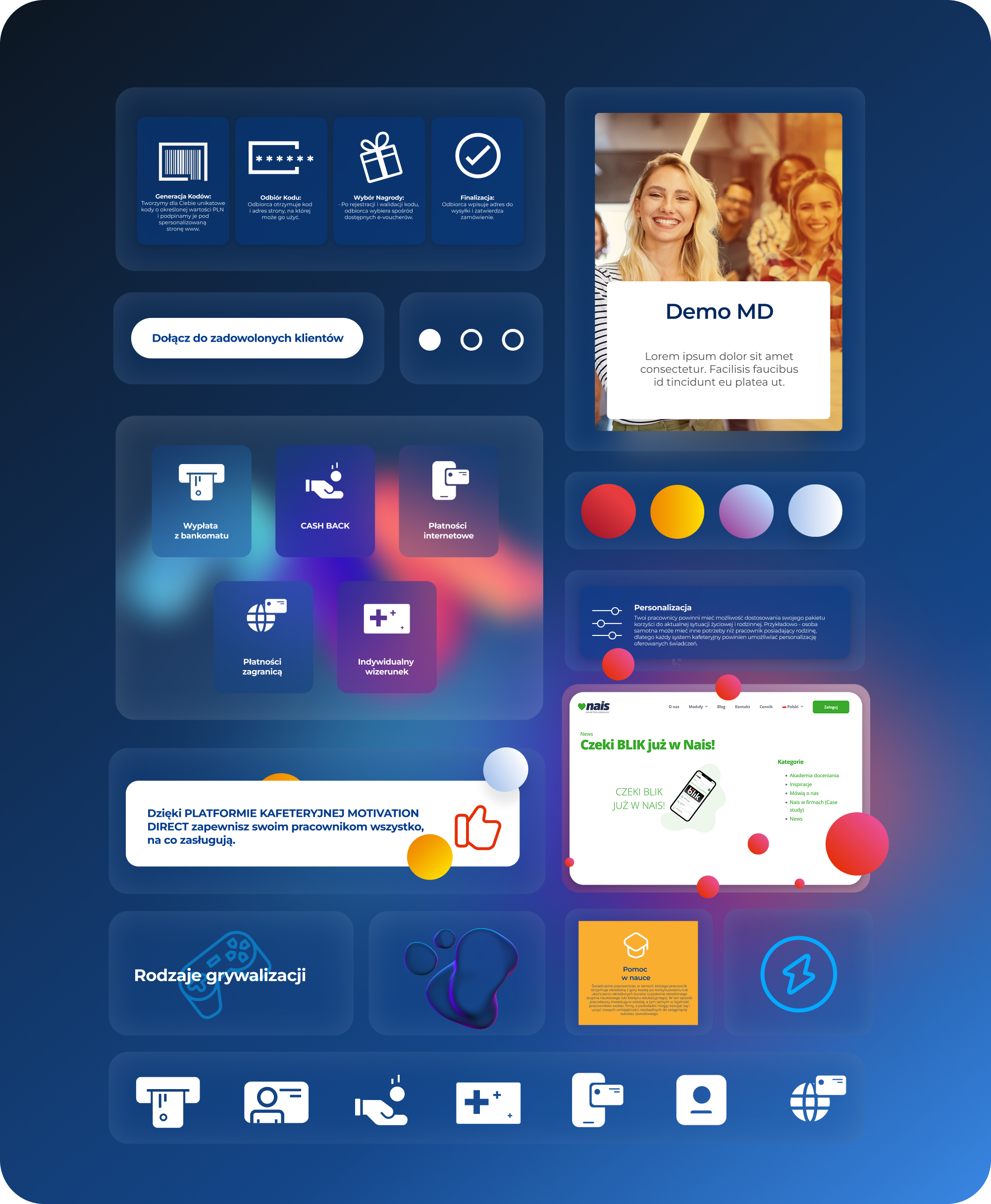
I created a complete UI design for the entire set of product pages. The main goal was to give them a modern, cohesive visual identity while maintaining clarity. I used a modular section layout, clear functional divisions, and generous spacing to highlight key elements such as CTAs and main offer points. Simple, readable icons were added to support the understanding of complex services.
Color Adjustment
One of the main challenges was the brand’s intense color scheme — strong tones that needed to be softened to avoid overwhelming the user. I proposed using transparency in backgrounds and overlays, contrast through subtle shadows and gradients, and visual lightness while preserving brand consistency. Icons and visual cues acted as supporting accents, improving overall readability.
