
Client
Hopsasanki
Year
2022
Role
Project Owner · Brand & Web
Services
- Web Design
- UX/UI Design
- Brand Identity
- Logo Design
- Brand Strategy
- Web Development
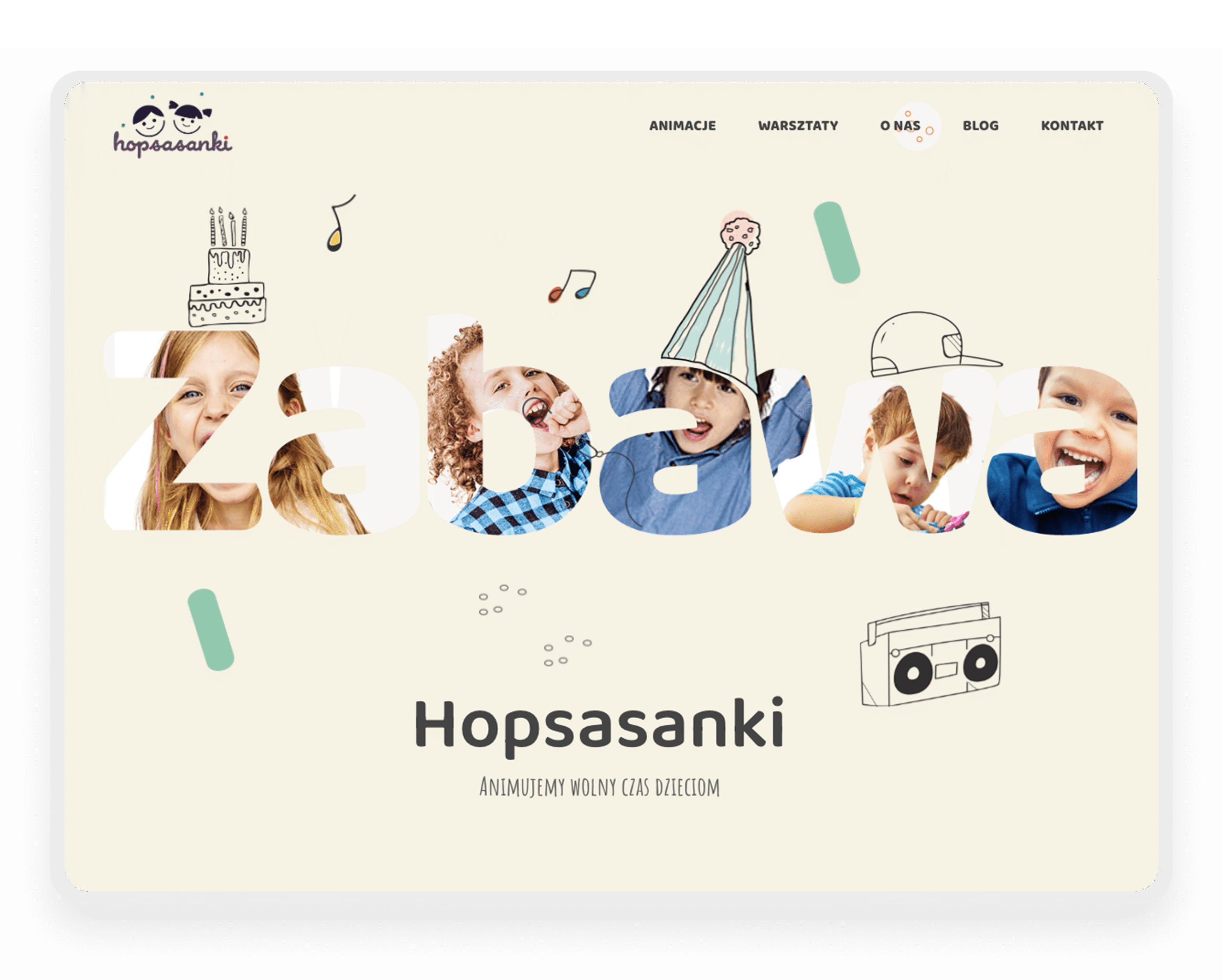
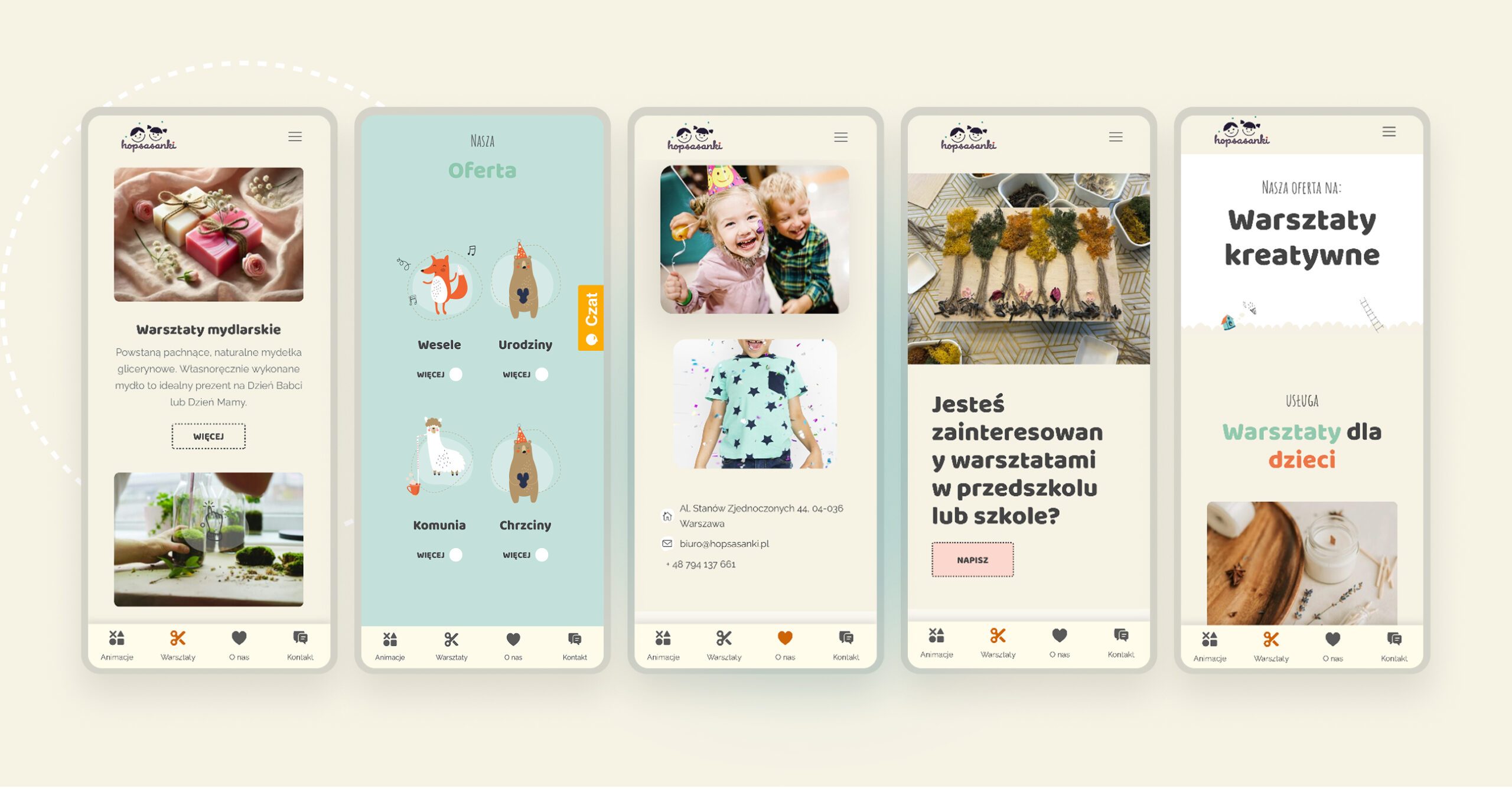
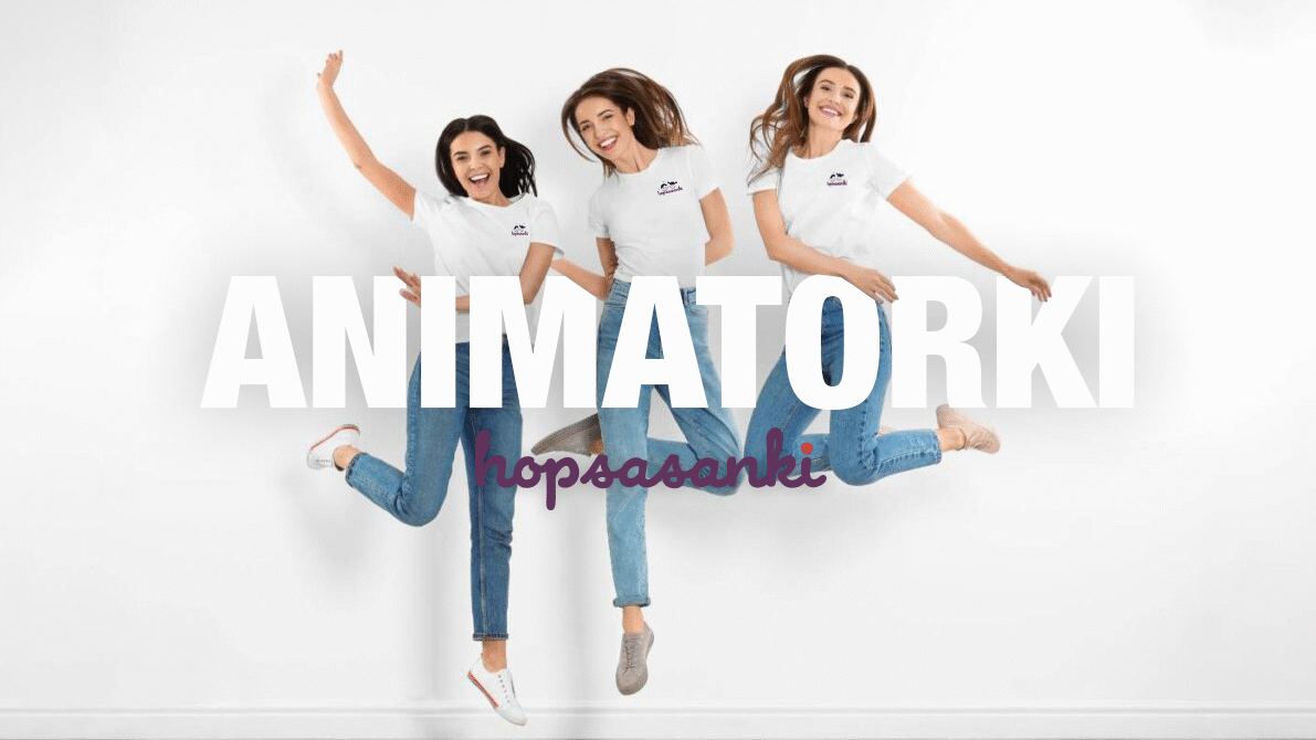
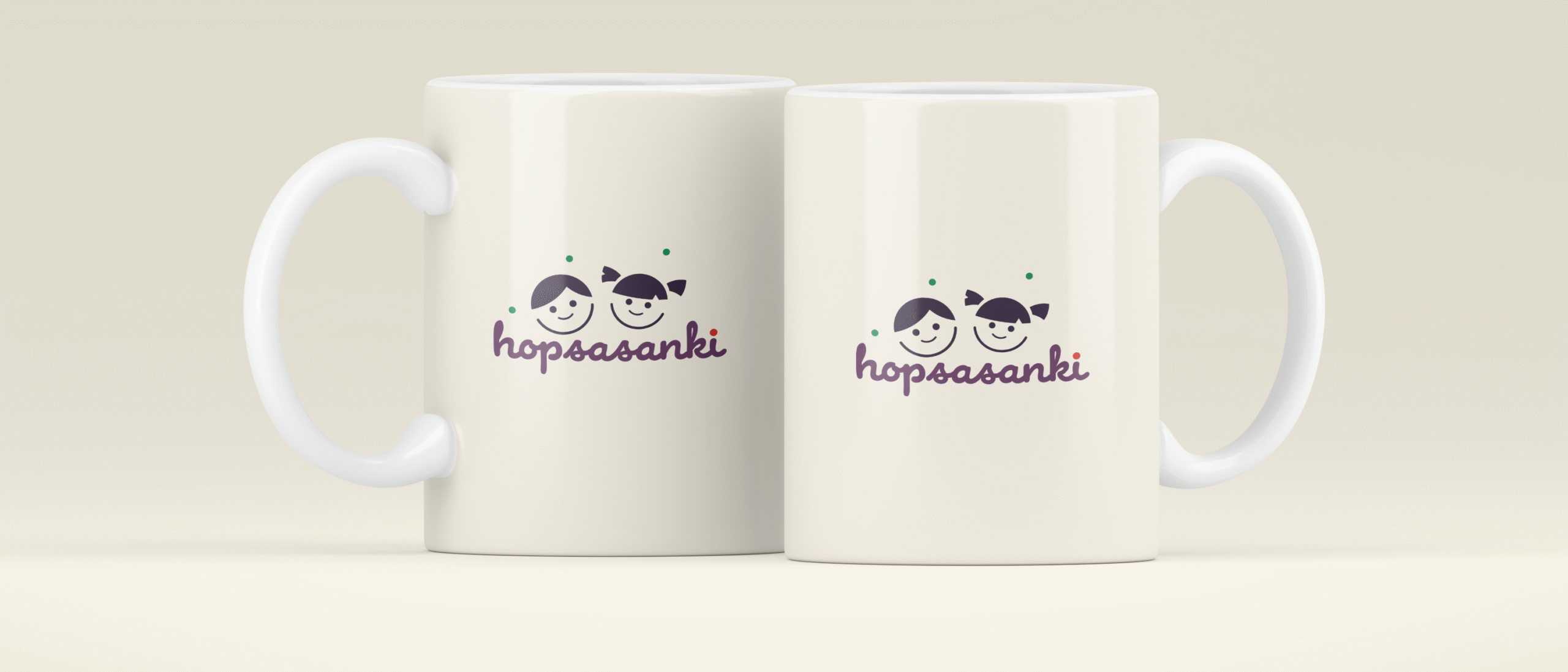
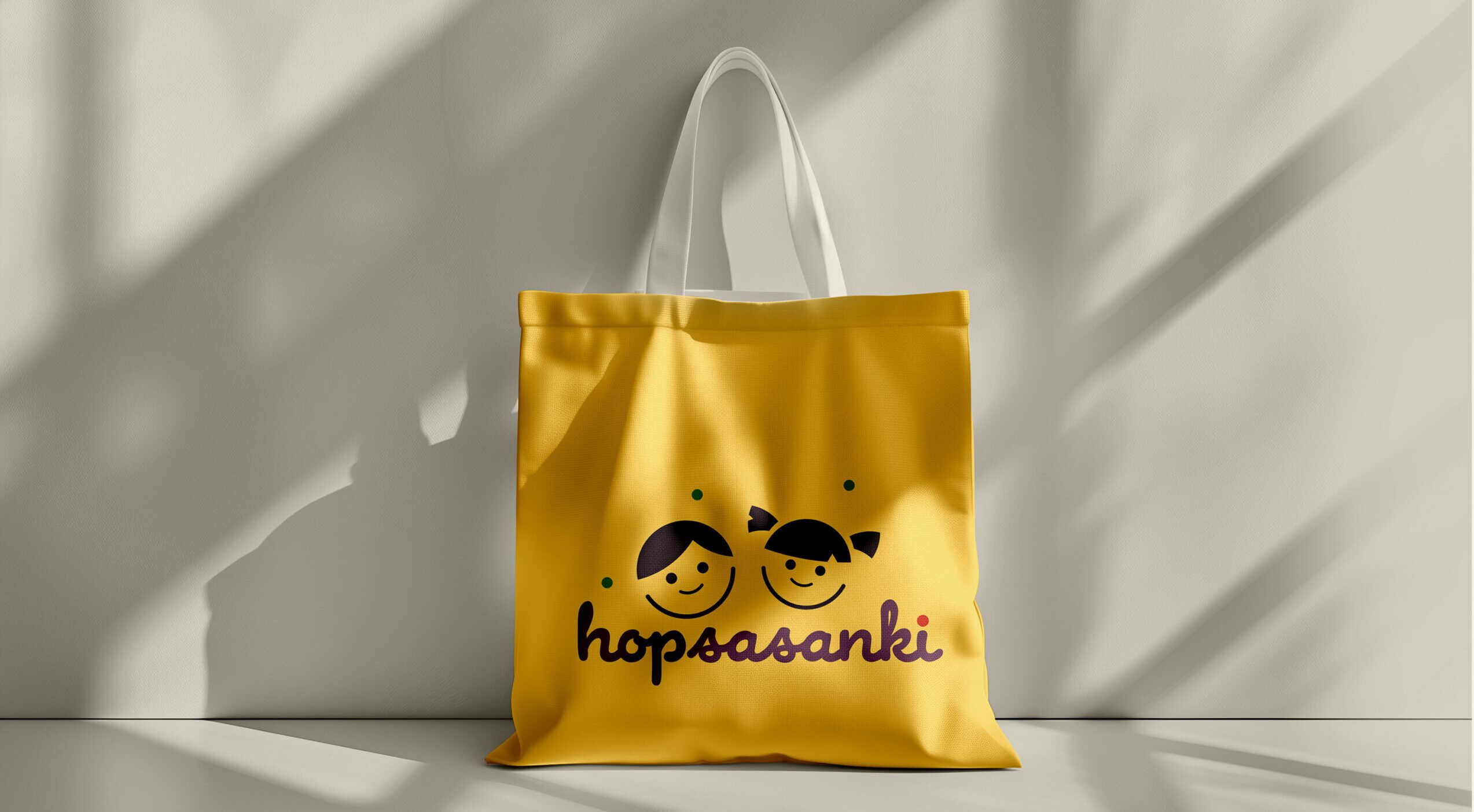
From the start we knew we wanted a light, colorful brand built on children’s joy. The slogan “Children first” captured that direction and became the foundation of the whole identity. The result is a coherent brand that feels authentic and builds parents’ trust.
Design that sounds like the brand
In branding I look for balance between expression and function. For Hopsasanki, it was key to attract attention while staying clear and aligned with the brand’s values.
A process that organizes communication
From first conversations to launch, I made sure everything held together. Each stage was a chance to fine-tune the design to real needs of the brand and its audience.