
Key Visual - What is it? 5 Facts That Will Change Your Brand Thinking
Key visual is not a logo on a background. It is a system of symbols, colors, and style that is meant to evoke specific associations and differentiate the brand from the competition.
And this is where many entrepreneurs fall into the same trap. They invest heavily in a polished logo, only to watch in frustration as their communication on social media, websites, and printed materials devolves into a disjointed collection of random graphics. A logo is a foundation—but on its own, it can't carry the weight of the brand's entire story. The missing link is the Key Visual: the visual key that holds the narrative together and ensures the brand remains recognizable even without a signature.
Key Visual is not a logo – it is a system of communicating vessels
The fundamental difference between a logo and a Key Visual is simple: a logo is a symbol, while a Key Visual is a system of rules . Not a single element, but a set of "building blocks" from which every message is built—regardless of channel and format.
Key Visual includes:
- specific typography,
- color palette,
- characteristic graphic forms,
- style of illustration or photography,
- composition rules.
A perfect example of consistency is the Heyah brand. Its red paw is a simple symbol, almost primitive in form, yet grounded in ironclad visual principles. These principles have built recognition over the years.
A focal point, figure, form of an object or person (...) that is intended to attract and focus attention, to attract the eye (eye catcher). – Krystyna Wojcik, Public relations from A to Z. Volume 2. , Placet, Warsaw 1997, ISBN: 83-85428-26-7 (44+2)
The Key Visual serves as a guide for graphic designers, agencies, and marketing teams. If a logo is a signature, the Key Visual is the language a brand uses to communicate with the market.
The Power of a Symbol: When Shape Becomes More Important Than Name
A well-designed Key Visual can be described in a single sentence. And paradoxically, the simpler it is, the more powerful it is. It is this simplicity, often developed over months, that allows a brand to make bold moves.
Examples:
Absolut – the bottle contour as a universal frame for any creation.
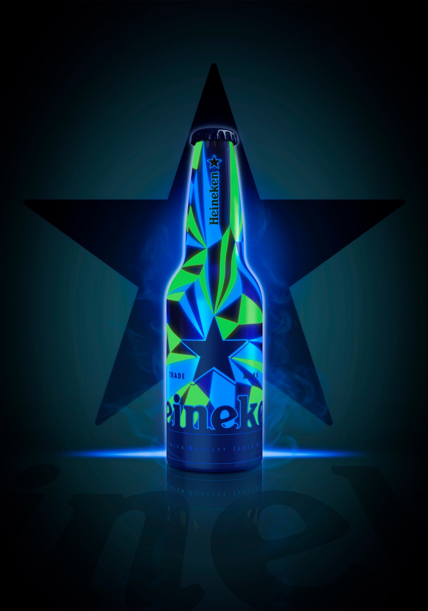
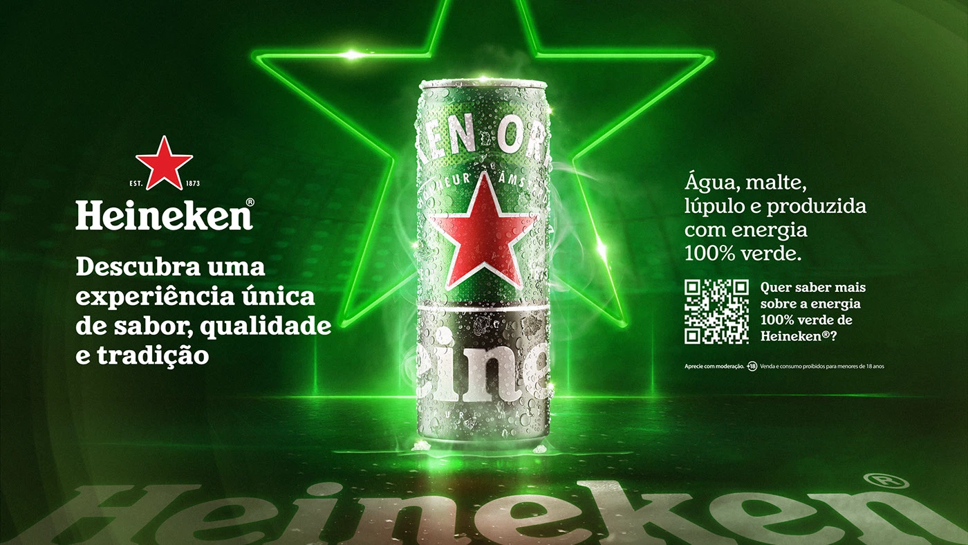
Heineken – a red star so powerful that the brand can temporarily change its color without losing recognition.
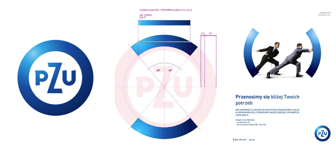
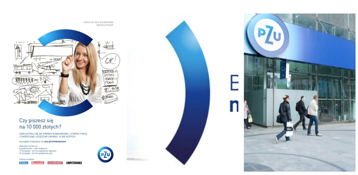
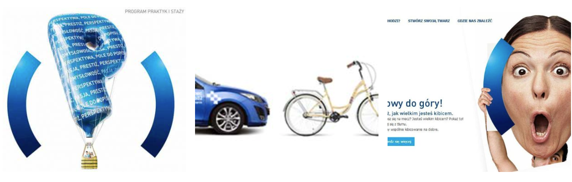
PZU — two characteristic arcs cut out of the logo, which are not decoration, but a metaphor for protection and "safety brackets".
An investment that earns money: why KV is a real savings
From a brand strategy perspective, Key Visual isn't a creative expense, but a business decision . It allows you to work with established rules instead of "reinventing the wheel" every time.
The effects are measurable:
Saving time and money – materials for social media, campaigns and offers are created faster, often based on templates.
- Reduction of technical errors – KV defines colors not only in RGB/HEX, but also in Pantone, which is crucial for printing.
- More efficient collaboration – clear rules reduce chaos when working with printing houses, media houses and freelancers.
A consistent visual identification system ensures that the brand always “tastes” the same – regardless of the format.
Brand Hero vs. Key Visual: Not Everything with a Face is a Key Visual
Brand personas often become part of the Key Visual, but not every "face" is. It's worth distinguishing two things here.
Fictional characters such as:
- Milka's purple cow,
- Little Hunger Danone,
- MAT InPost (parcel with eyes),
They work because they are firmly embedded in the brand's visual principles . They are designed, controlled, and repeatable.
Celebrities are different. While they build reach, they are based on personality, not on a graphical system. Therefore, they are a less stable element of the Key Visual than a character designed from scratch.
The AI Revolution: How Technology is Transforming Key Visuals
Artificial intelligence is increasingly entering the field of visual system design. It enables the creation of coherent yet flexible graphical worlds , tailored to the context and user.
A good example is YSL Beauty's collaboration with the Kivisense platform. By using AI to adapt key visuals across e-commerce platforms (including Tmall and WeChat), the brand achieved:
- increase in production efficiency by 75%,
- cost reduction by 65%.
Today, a single visual model can generate dozens of formats—from billboards to interactive banners—without losing consistency.
Thumb Test for Your Brand
A Key Visual is the foundation of long-term communication. It's behind icons like Heyah's red paw, PZU's brackets, and the Rolling Stones' tongue. Without a consistent visual key, a brand loses credibility, and each new project begins with a fight for attention—usually a losing one.
Finally, one question worth asking yourself:
If you removed the logo from your last ad today and covered the company name with your thumb, would your customers still know it was you?
If the answer is "no," the problem isn't the logo. The problem is the lack of a Key Visual.